Today I have decided to post about something practical, that really anyone in business, but especially in the financial industry should know about, Microsoft Excel.

So first off, assuming we know nothing (and have been living under a rock since the 90’s) what the hell is it?
Excel is a spreadsheet software first developed in 1987 for Windows computers. It has since progressed to be available for Apple devices so don’t fret! The program is also powerful and has calculation, graphing, tables, and the ability to add in your own programs via Visual Basic “macros”. Why should you care about something out of the 80’s? Excel is pretty much universal in all workplaces for reporting, tracking, calculating, quantifying, etc etc etc. It is imperative to at least know some basics, and the capabilities that are out there, so you’re prepared to #slay all day long.
How can Excel help you? Let’s take a look at some key functions and capabilities! (Yes, inside I am a HUGE nerd and that excited)
VLOOKUP/HLOOKUP
Ok so VLOOKUP is pretty much your life if you are in finance. This is the shit. It is a lookup and reference function that lets you find your info in a table or range (area of data) in a column.
Basically what it is saying to you is: I am VLOOKUP, what do you want? where is it? Do I need to find the exact thing or just get close?
=VLOOKUP(Value you want , range where it is, the column number in the range containing the return value, Exact Match or Approximate Match – indicated as 0/FALSE or 1/TRUE).
Example? find a particular security in a list of thousands in a certain industry.
In the cell I wanted to have the value returned in (displayed to me), I would type:
=VLOOKUP(SECABC, A1:A45, 0) which says find me SECABC in column A, and it must be exactly that.
HLOOKUP is the exact same, just for things across a row of data (ie A:C) 🙂
How do you remember the difference?
H= HORIZONTAL
V= VERTICAL
Just remember:
To effectively use the VLOOKUP function your data needs to be well organized and suitable for using the function.
VLOOKUP works in a left to right order, so you need to ensure that the information you want to look up is to the left of the corresponding data you want to extract.
PIVOT TABLES
These little dope shows are one of the most powerful things Excel can do, understanding them makes you super valueable, AND a simple one takes about a minute to build.Being able to quickly analyze data can help you and your team make better business decisions. Sometimes in a sea of data, it’s hard to know where to start. PivotTables summarize, analyze, explore, and present your data in an easy to read and understand format. PivotTables are highly flexible and can be quickly adjusted depending on how you need to display your results. You can also create PivotCharts based on PivotTables that will automatically update when your PivotTables do. HOW COOL!
How you can build a PivotTable in a minute:
- Select any cell in the source data
- On the Insert tab of the ribbon (the top menu), click the PivotTable button
- In the Create PivotTable dialog box, check the data and click OK
- Drag a “label” field into the Row Labels area (e.g. customer)
- Drag a numeric field into the Values area (e.g. sales)
- Behold your work in wonder and amazement.
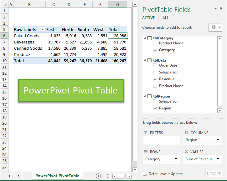
Pivot tables can create easy to read parts lists, financial statements, recipes, sales leads, pretty much anything. Hell, they can even display your shoe data by type colour and cost if you’re into that sort of thing.
GOALSEEK
If you know the result that you want from a formula, but are not sure what input value the formula needs to get that result, use the Goal Seek feature. It is basically a magic genie in a bottle for helping you reach your goals!
For example, suppose that you are like me and run a side hustle. You know how much money you want to make this month, and generally which of your products you sell easily. You can use GoalSeek to determine what mix of products you will need to secure in order to meet your goal.
GoalSeek does all your worrying for you and runs multiple what-if scenarios to find an ideal solution. This is helpful for sales (as I mentioned), loans (finding interest rates), capacity problems, staffing, and many other business functions.


CHARTS
It can be a real bitch to waste time staring into the abyss that is a sloppy Excel workbook with endless data. Charts allow you to illustrate your workbook data graphically, which makes it easy to visualize comparisons and trends. What does that mean? Make it pretty, and easy to read in under 10 seconds. This is expecially useful when displaying research data, market data, or anything else where you are looking to see what is #trending.
How do I make these magical masterpieces?
- Get your data into Excel. First, you need to input your data into Excel. Duh.
- Go to the ribbon (we talked about this, its on the top) and hit INSERT CHARTS.
- Switch axes, if necessary.
- Adjust your labels and legends
- Change the Y axis measurement options
- Reorder data, if desired.
Hold up, what do I mean switch axes? Sometimes you may want to change the way charts group and display your data. For example, you have a bunch of data that are grouped by year, with columns for each type. However, we could switch the rows and columns so the chart will group the data by type, with columns for each year. In both cases, the chart contains the same data—it’s just organized differently, and shows different trends.
Also remember, a good chart or graph should have ACCURATE, DESCRIPTIVE labels so the person checking it out knows what the HELL they are looking at.

THIS IS A BAD CHART
The above is an example of a lazy, shitty Excel chart. Day? what day is it? Did you start on Monday? What month are we in? Temperature… well is this Fahrenheit, Celsius, KELVINS????? Did you divide shit by 10 somewhere for fun? HOW WOULD I KNOW?
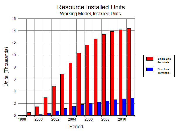
It has a title, and a subtitle for further explanation, tells me units, and what the hell I am looking at. Slight criticism: Maybe go for Year instead of Period (you never know these days… I am pretty blonde and might get confused), but overall I gfet the idea of what I am looking at.
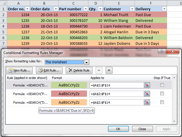
FILTERS
You can also filter by more than one column. Filters are additive, which means that each additional filter is based on the current filter and further reduces the data.

OK so no I didn’t treat y’all like children and explain in depth what a cell, column or row is, and how to open up the program. You are smart enough to figure it out. The point I am trying to get across is that these are the basics (IMO) of useful functions. These will make you extremely valuable at work. Keep in mind there is so much more to Excel! There are calculations built in there (yes the addition and subtraction basics) like Net Present Value, which saves you a LOT of work. You can do so many amazing things, and automate processes to make you a lean, mean Excel machine! If you want to hear more about Excel, and get some more details from my perspective comment below, and I will do another post!
xoxo
-Em
BONUS TIP: (Submitted by my bestie at MBA School) The almighty “$”
NOT MONEY GUYS, this is an EXCEL post!
The $ in Excel allows you to anchor a row or column.
When you copy formulas from a certain cell and send them to others in your spreadsheet, the formulas will copy cells referred in that formula relative to the position where they are being copied to.

For example
In Cell A1, I have 5.
In Cell B1, I have the formula +A1. B1 will now show you the value of 5 (since 5 appears in Cell A1).
When I copy the formula in Cell B1 to B2, Excel will copy the formula ‘relative’. If you look in the newly copied formula in Cell B2, you will see the formula +A2 (where as the original formula it was copied from was +A1).
Sometimes you don’t want this happening, like if you are adding in a constant factor to your calculation. The dollar sign ‘anchors’ a column, row or both.
Examples:
+$a1
+a$1
+$a$1
If I wanted to anchor the cell reference, instead of having the formula +A1 in Cell B1, I would sneak in $ before both the column and row reference (e.g. +$A$1). NOW if I copied that formula from Cell B1 to B2, instead of seeing +A2 (relative), you see the formula +$A$1 in Cell B2. No matter where on the spreadsheet I copied this formula to, because it is anchored, it would always read +$A$1.
